![floq-logo-by-cc-2-white@2x.png]](https://knowledge.conferencecompass.com/hs-fs/hubfs/floq-logo-by-cc-2-white@2x.png?height=40&name=floq-logo-by-cc-2-white@2x.png)
Data types allow you to categorize and organize all information in your event app, such as session items, people, sponsors, or venues. By setting options across data types, content tabs, and sections, you can customize what information is visible to attendees and manage how items appear on screen.
- What are the data types?
- Create and delete types
- Settings per data type
- Organise your data in the Content tabs
- Organise data on a tab within the sections
What are the data types?
Data types structure your event content/data into clear categories such as programme items, institutions (exhibitors, sponsors, etc), persons (speakers, authors, etc), tags angs and places. They define what is displayed in the app, where it appears, and what attendees can see or interact with.
Here are a few ways you can customize data types:
- Feature toggles: Enable the rate card for programme items of the type Session, and don't show it for Presentations.
- Access control: Restrict access to specific tabs, such as poster resources, to designated attendee groups (Resources tab of the type Poster to members of a certain group)
- Embargo rules: Hide the Info section of items of the type Abstract until the embargo has been released.
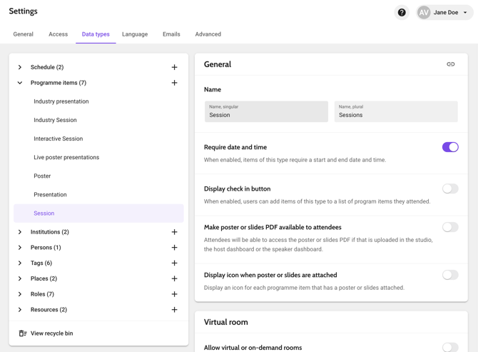
The default template comes with a basic data set of types and settings, that you can tweak if you like. If you create your own template export from an existing event, the types of that event are included.
Create and delete types
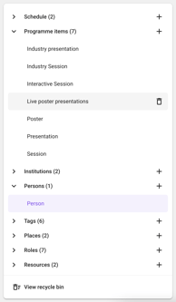 👉 Where to edit data types in the studio? Go to Event settings > Click on the tab Data types on top of the page.
In the table on the left, you see an overview of all categories for which you can create types. The number next to a category is the number of types in it.
To add a new type, click the + icon. To delete a type, click the trashcan that appears when hovering with your mouse over an item. Please note that you cannot delete types that contain data. Deleted types can be found and restored through the View recycle bin link below the table.
The following categories are available:
|
Category |
Examples of according data types |
Purpose & scope |
|
Schedule |
Scientific Schedule, Industry Track |
All types of schedules you have. Some events have one, whilst others have multiple. |
|
Programme Items |
Session, Presentation, Poster, Abstract |
Time-based agenda items, e-posters, and nested sub-sessions (including parallel items). all types related to the daily programme, with or without a start and end time. |
|
Institutions |
Exhibitor, Sponsor, Partner |
Organizations, booths, and partner profiles. |
|
Persons |
Speaker, Author, Panelist |
Contributor profiles, presenter bios, and directory listings. |
|
Tags |
Topic, Product Category, Sponsorship Level. |
All types that are used to group data used for filtering and color-coding using hex codes. *remember, this is not the tag itself (Eg: Gold Sponsor, Silver Sponsor) but rather the category of the tags (eg: sponsorship level). |
|
Places |
Room, Location, Exhibitor Booth |
All different types of places categories: Physical or virtual event locations mapped to floor plans. |
|
Roles |
Chair, Primary Author, Co-Presenter |
Relationship roles linking Persons to Programme Items. |
|
Resources |
External Link, Slide Deck PDF, Abstract URL |
Document links, web resources, and supplementary files. |
Settings per data type
For all types, you need to add a singular and plural name. These names are used in the title bar or in the section headers on the detail page of an item.
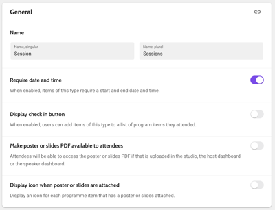
Types of the categories Tags, Roles and Resources only require the name. For the other categories, additional settings are available.
Programme items
General
- Require date and time: if enabled, adding a start and end date and time is required for an object of this type. Disable this for on-demand content or untimed e-posters.
- Display check-in button: if enabled, a Check-in button is displayed in the detail page in the app that allows users to add programme items of this type to a list of items they attended.
- Make poster or slides file available to attendees: if enabled, any PDF that is uploaded (in the dashboard or through the studio) can be viewed by attendees. If recorded by the host, attendees can also play the audio description and video introduction.
-
Display icon when poster or slides are attached: if enabled, an icon is shown under the title for those items that have a PDF linked.
- Allow adding a virtual room is off by default. Only if enabled, the Restrict access and Backstage access fields below are shown.
- Restrict virtual room access to group(s): decide whether the virtual rooms or recordings can be accessed by anyone that can access the event, or only by a specific group.
-
Upload poster or slides: decide whether to give an invited host or presenter the ability to upload their poster or slides on their own.
- Start meeting: decide whether to give an invited host or presenter the ability to start broadcasting their live presentation themselves.
- Video recording: decide whether to give an invited host or presenter the ability to record or upload an introduction video for their poster that would be available on-demand.
- Audio recording: decide whether to give an invited host or presenter the ability to record an audio to accompany the uploaded slides.
Image
- Side panel banner: set a default banner to appear in the side panel, above the programme item or poster name. Note that for every item, the default banner can be overwritten.
Institutions
General
- Layout of detail page: defines the layout of the page when it is opened from a list: exhibitor booth or side panel.
- Show placeholder images: when enabled the placeholder image is displayed when no logo has been uploaded.
- Background image: set a default background image banner to appear in the side panel, behind the institution logo. Note that for every item, the default image can be overwritten.
Persons
Image
- Background image: set a default background image banner to appear in the side panel, behind the person's profile picture. Learn more here.
Places
General
- Floor plan card content: set this to define what to show in the bottom sheet when opening the place from the floor plan: Schedule (a list of programme items taking place in that location), Institution profile, or Description.
Organise your data in the Content tabs
The data for an item is distributed over 4 or 5 tabs.
👉 Where to locate this in the studio: go to Data types > Choose any data type (programme items, institutions, persons, tags, etc) > Scroll to the end and find the Content section > here you will see the tabs.
Per tab, the following information is displayed: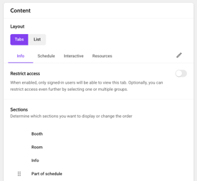
- Info: info text, such as abstracts or biographies, and related persons and tags.
- Schedule: linked programme items, such as presentations for a session or a topic.
- Interactive: all built-in interactive features, such as chat, vote, ask and rate.
- Resources: links to the poster or slides PDF and to other websites.
- Contact: contact information, such as email address, phone or social media URLs. Only applies to institution types.
In the studio, all tabs are shown, while in the app some might be hidden because there is no data to display.
Show data in a list instead of on different tabs
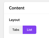 You can choose how content is presented to attendees:
- Tab Layout (Default): Categorizes content across separate horizontal tabs. Attendees tap between tabs to view details, making this ideal for data-heavy sessions.
- List Layout: Consolidates all tab content into a single continuous scrolling page. Sections stack vertically, making it best for straightforward sessions with minimal content. Note that tab-specific group restrictions do not apply in List Layout.
The 'List' layout is only available for programme item types. In this layout, any restrictions set to a tab do not apply.
Reorder, rename, and restrict tabs
- Reorder and rename: Click the Pencil icon to adjust tab titles and use the drag handles to change their order.
- External features: If using external tools like Slido or Kahoot, add the URL under Resources and rename the tab for clarity.
.gif?width=460&height=259&name=Untitled%20design%20(1).gif)
For example: If in data type Programme items: Session type the order of the tabs are: Info, Schedule, Interactive and Resources: when someone enters a session within the mobile app and chooses any Session, they will see the same tabs in the same order. If there is nothing under Schedule tab for instance, it will by default not appear on the Session page.
If you use external interactive features, like Sli.do or Kahoot, they need to be added with a URL under “Resources”. You can rename the tab for clarity.
- Restrict access: Restrict specific tabs to target groups (for example, limiting poster PDFs to paid attendees). Groups must first be created in the attendee list.
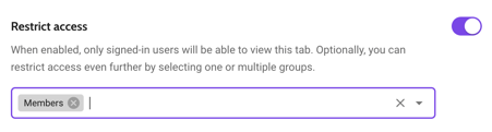
To restrict access, you first need to create groups in the attendee list.
Organise data on a tab within the sections
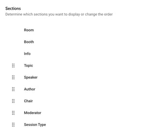 The order of the related types below Sections reflects the order of the information attendees will see in the app. When for example both a topic and a speaker is linked, the topic is shown first if it is positioned above the speaker.
Reorder and rename sections
To reorder sections, click  , hold and drag them to the desired position. Information and places have a fixed location in the app and cannot be moved.
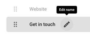
By default, the type name is used as a heading above the linked items in the app. If you want to use a different name, click the pencil icon next to the type name and enter a custom name.
For example: If you have a session that has both authors and chairs and you want to show the chair first before the authors, then you can reorder the tab and publish a release to show the results.
Hide information from the app
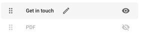
By default, sections without content are invisible on the web and mobile app. You can also hide sections with content by clicking the eye icon on the right. Think of abstracts that are under embargo or URLs that can only be made public after the event.
⚙️ Troubleshooting
Why can I not find data in data type?: You can think of it like this: the Data section is where you add the data about the sessions, the persons, the tags, etc. Data types help categorize the data so it can be easily navigated in the backend and displayed on the frontend, while Pages actually help with the layout of the data according to data types.
Why can I not delete a data type?: You cannot delete a data type if it currently contains active data. Remove or reassign all items linked to that data type first, then try clicking the Trashcan icon again.
Why is a configured tab or section not showing up in the app?: Sections and tabs without any content automatically hide in the app. Additionally, check if the Eye icon was toggled to hidden or if group access restrictions are preventing your account from viewing it.
Why are my tab restrictions not working for a programme item?: If your programme item uses the List layout, all content is merged into a single scrolling page, which bypasses tab-level access restrictions. Switch back to the Tab layout if you need to restrict specific content.