This article describes all the page types in the app.
We are gradually updating all Floqs to a new version in which the home, menu and pages are completely revamped. If your Floq is already on the new version, refer to the article about the pages.
The following page types are supported in the web and mobile app.
- Image Carousel
- Daily programme
- Floor plan
- Happening now/next
- Information page
- Intro page
- List (persons, exhibitors, topics, etc.)
- Navigation menu
- Search
Pages can be added on the Pages & Structure menu item, tab Pages. Click the + in the table next to the respective page type. For each page, the name specified below the Page name appears in the top bar, unless a page is fullscreen, like the intro or carousel page.
You can upload a branding banner for pages of the type daily programme, navigation or list.
Image Carousel
A carousel is a page with one or multiple full-screen images. The carousel is only displayed on the mobile app and appears upon opening the event, after the intro page. You can create multiple carousel pages, allowing you to switch them throughout the event.
Add an image by clicking Add image and then Select image. The preferred dimensions of the file are 1500x2000 px, PNG or JPG, less than 2 MB. If your image is another size, you can crop it to the right size after selecting it.
When adding a connected object to an image, a button will appear on this image in the app, allowing users to add the item to their favourites directly from there.
Other settings for the page are:
-
Image transition: you can choose to display the images as a slideshow and set a duration per image (1-9 seconds) or you can require your users to swipe to view the next image.
-
Close icon: at the top right of the carousel, an icon is shown that closes it. Choose here what that icon should look like.
-
Ask to show: these options allow you to give the user a message before and after displaying the carousel, to ask whether it should be displayed now or again. When unchecked, users will not see these messages.
To have the carousel page appear in the mobile app, you need to enable it first. Go to the tab Home, and select the page from the dropdown below Carousel. Create a release to show your page in the app.
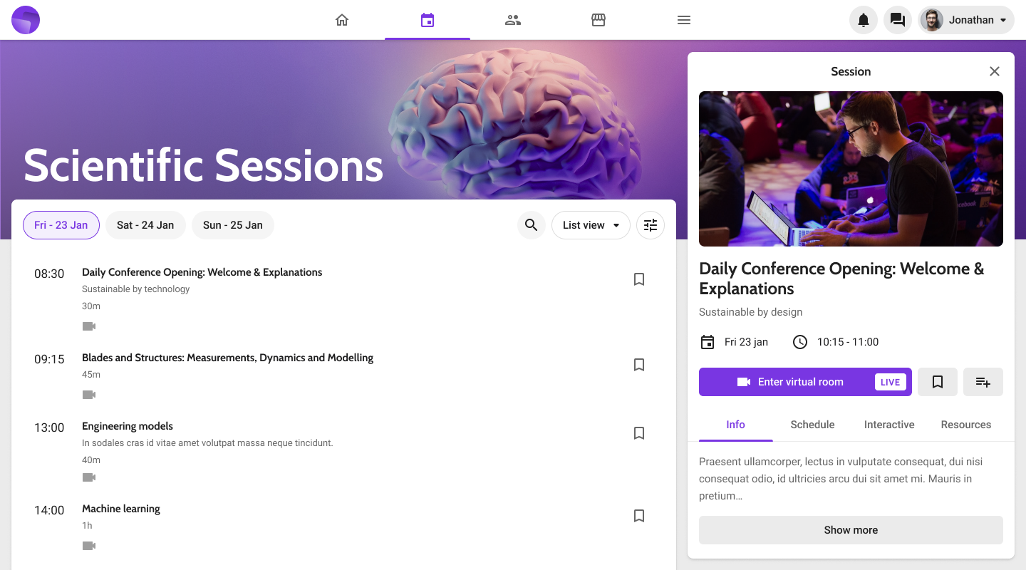
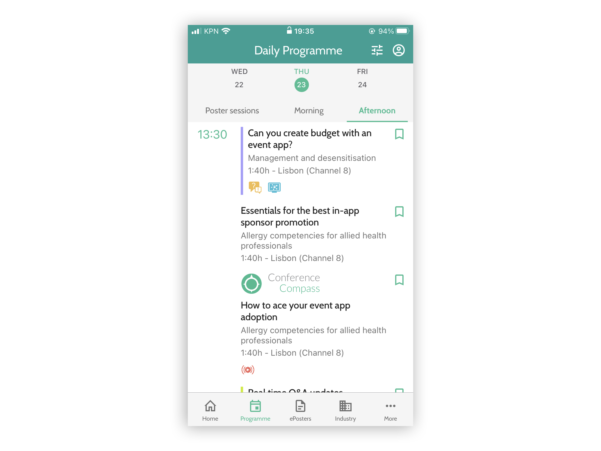
Set up a daily programme page
The daily programme is a sorted overview of all program items in the data. The data itself can be edited in the Data section.
By default, the programme can be accessed by anyone. You can enable different types of access restrictions to a programme:
-
Restrict access to signed-in users only.
-
Protect the page with a password.
Other settings for the page are:
-
Root element: Here you can select where the hierarchy of the programme should start. Please note that only items marked as Is root element in the data structure will show up here (usually "days").
- Filter by classifier: You can set a default filter on a programme by selecting a classifier. You can use this feature to highlight certain sessions, that are also part of the full programme, on their own programme page.
-
Default layout: this specifies whether the programme should be displayed as tabs (like the screenshot above), as lists, or as timetables (vertical or horizontal) on the web and mobile app.
- Timeframe display on list layout: this defines how the timeframes are displayed in the mobile app: as tabs or as vertical separators.
- Programme item grouping on timetable layout: in the timetable layout, you can group the sessions by location, by a classifier, or don't group them at all.
-
Filters: you can define what users can filter. You can choose max 3 filters (classifiers).
Floor plan
The floor plan shows one or multiple floor plans of the conference venue. With the search button top right, an overview of all places on the plan can be opened. You can only create one-floor plan page per event (which can contain multiple floorplan images).
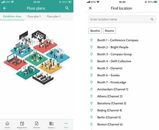
Add an image by clicking Add image and then Select image. The dimensions of the file should be maximum of 4000x4000 px.
When there are multiple floor plans, the Name is displayed on the tab.
Other settings for the page are:
-
Visibility of pins when opening page: you can choose to either display all pins when users open a floor plan page (Visible), or to not display any (Invisible).
-
Visible place types: choose here which place types to display in the floor plan and the overview of places.
Happening now/next
Happening now/next pages show users the items from the daily programme that are going on now or that will start soon. These items are automatically filtered based on the settings of the page.
You can create multiple now/next pages, for example, one that shows all things that are running now, and one that shows what will start in 15 minutes.
Settings for the page are:
-
Events to show: choose whether you want to display events that are going on now or those that will start in X minutes/hours.
-
Intro text: this text is displayed above the items that will appear in the list. You can give a bit more information here about the items in the list, for example: 'The following sessions are starting in 15 minutes'.
-
Message when there are no events: when a user opens the page at a time when there are no events suiting the criteria, this message will be displayed.
-
Filter by classifier: you can narrow down what is shown on the page by filtering on a classifier. This for example allows you to only show sessions on a certain topic.
-
Included program elements: you can set which types of programme items should be shown in the list. We advise checking only types of the same hierarchy to avoid a lengthy list. For example, select sessions but not presentations.
Information page
Information pages are pages in the app with custom HTML. They can contain anything you want, for example, practical information pages, about pages, or links to Twitter feeds.
By default, anyone can view the page in the app. You can enable different types of access restrictions to a page:
-
Restrict access to signed-in users only.
-
Protect the page with a password.
There are a few points to take into account when configuring the page.
Copying text from Microsoft Word or web pages
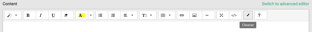
When copying text from Microsoft Word or from web pages, a lot of unwanted styles are coming along that might mess up your intended layout. You can remove these styles in different ways:
-
Click the Cleaner button on the toolbar after pasting the text
-
On macOS, right-click in the field and choose Paste and match style instead of just Paste.
-
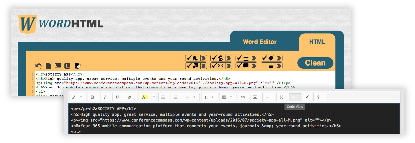
Use a converter such as https://wordhtml.com/ to clean the text. Paste your copied text in the Word Editor tab, then switch to the HTML tab. Tick the boxes like in the image below and click Clean. Then copy the code in the code field of your information page. Click the Preview button to see if your text looks as intended.
 Images
Don't simply paste images in the content field as this could result in errors when publishing the data. Instead, link to an existing image on the web with the Image button in the toolbar. If you do not have a URL of the image, you can create one via the image library.
Please note that by default, Android users cannot zoom in on images (iOS users can). If you want to allow this, click below the Page name on Advanced settings to expand it, and tick the box Enable zoom.
Tables
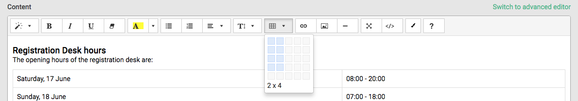
To add a table, you can click the table icon in the toolbar. Select the number of rows and columns you want and click to place the table.
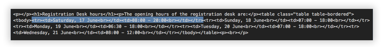
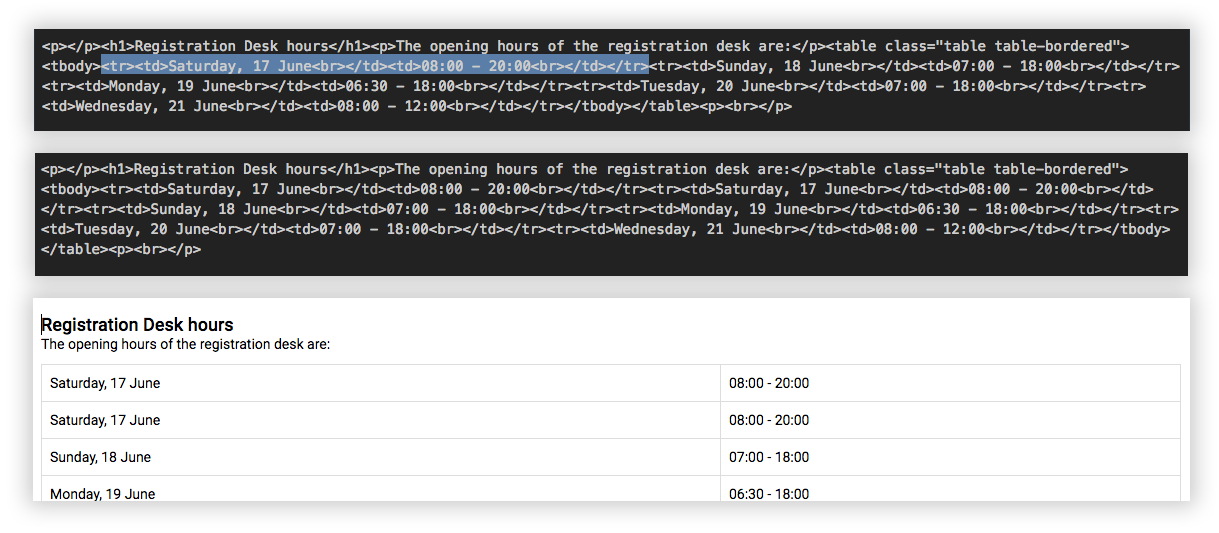
Removing or adding rows is unfortunately not possible with the toolbar. To do this, you need to go to the HTML code view. Start by finding your table, which starts with the tag <table>. Rows are indicated with the tag <tr>, table cells with <td>.
-
Remove a row: find the row you want to remove. Using Ctrl+F might help you to do so. Select everything between and including the tag <tr> and </tr> around the content and delete it. Return to the normal view to see if it's deleted.
-
Add a row: Find the row after which you want to insert the new row. Using Ctrl+F might help you to do so. Select everything between and including the tag <tr> and </tr> of this row, copy it and paste it right after the same </tr> tag. Return to the normal view to see if you now have an extra row with the same content. You can change the content of the row in the normal view.
Intro page
The intro page is shown upon opening the event in the mobile app. You can only have one intro page per event but the page can contain multiple images which will be displayed for 1-9 seconds each.
For the intro page, images of different sizes have to be uploaded in order to make sure the images fit perfectly on different devices. The requested image dimensions and suffixes can be found in the Artwork Guidelines.
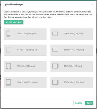
You can upload the images in two ways:
-
Click a grey button to select the file for that type on your computer.
-
If the naming of your files ends in the pattern described in the guidelines, you can click Select multiple and select all files at once. They will then automatically be linked to the right fields.
Other settings for the page are:
-
Duration: Set how long you want your page to appear.
-
Close icon: Optionally, you can add a close icon to the page, so that users can close the intro page to go directly to the home page.
After creating the page, you still need to select it on the home screen. Go to the tab Home, and select the page below the Intro page. Create a release to show your page in the app.
List (persons, exhibitors, topics, etc.)
Lists show an overview of any data in the app: for example posters, exhibitors or persons. These lists can be filtered, for example, to only show gold sponsors or oncology-related posters.
By default, anyone can view the page in the app. You can enable different types of access restrictions to a page:
-
Restrict access to signed-in users only.
-
Protect the page with a password.
Other settings for this page are:
-
Intro text: This text is displayed above the list. You can give a bit more information about the items in it.
-
List view layout: Defines whether the selected items are displayed as a List, or in a Grid view with large images. At this moment, grid view is supported on the web and mobile for institutions and persons, and on the web also for posters and programme items.
-
Search bar: The search bar is added right below the title bar. It can be useful to add it if the list is very long, for example for all persons in an event.
-
Data filter: The filters define which items are shown in the list. You can filter by type and optionally by the classifier. Persons or institutions can be filtered even further by role.
-
Grouping: Lists can be grouped by initial of name, of ordering, or a classifier. In the studio, you can select the option you prefer. In case of grouping by classifier, you can choose what specific classifier type to group the list on. All items then appear in the same list but are grouped by the selected criterion.
-
Sorting: Drag the options in the desired order in which you want to sort the items.
Navigation menu
Navigation pages link to other pages or objects in the app. They can be used to add extra levels of navigation, besides the home menu.
Default, anyone can view the page in the app. You can restrict this below Access restriction & protection. Options are:
-
Restrict access to signed-in users only.
- Restrict access to users belonging to a certain group.
-
Protect the page with a password.
In the settings below Layout, you can choose whether you want to display the linked items as a vertical menu (left) or as horizontal tabs (right).
Below Items, add the items to navigate to. The Title is the name displayed in the menu or the tabs. You can link to individual objects, for example, an institution or a specific session, the My Congress page or any other page you have created. Below Advanced Options, you can optionally protect the links with a password or require users to sign in before they can access the page.
If you chose the layout option Menu, you can optionally select an icon to display on the left side of the title and also link to a URL. For Tabs, choose which one is selected upon opening this page. Naturally, this can only be one item.
Search page
On a search page, users can search for anything in the app with a keyword. The search results are sorted per type.
Settings for this page are:
-
Intro text: this text will be shown when there is no keyword entered yet.
-
Grouping: choose whether to display each result individually (None) or to group the search results by category (By category). As a search for general keywords could lead to a large number of results, it is recommended to group them.
-
Categories to search in: uncheck the types you want to exclude from the search results, such as Days and Timeframes.
Page branding
You can upload a branding banner for pages (1920x384 px) of the type daily programme, navigation or list. This banner is shown above the page on the web app.
You can tick this box to have the page name appear or not: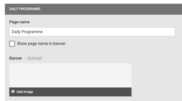
In the example below, the page name is shown: