![floq-logo-by-cc-2-white@2x.png]](https://knowledge.conferencecompass.com/hs-fs/hubfs/floq-logo-by-cc-2-white@2x.png?height=40&name=floq-logo-by-cc-2-white@2x.png)
Following our guidelines to create your artwork ensures that images in your app will appear optimally across different devices and screen sizes.
For the artwork guidelines for a multi-event app (Community app), read this article.
🔴 Before you start
Before creating your artwork, keep the following in mind:
- Keep image file sizes below 2 MB whenever possible for optimal app performance.
- Use JPG for photographs and PNG for logos, illustrations and images containing text.
- Keep important content (logos and text) away from the edges, as some images are cropped differently across devices.
- Use high-resolution images to avoid blurry artwork.
- For images that appear full-screen, avoid placing text or important graphics near the edges.
- Files are clearly named (for example, AppIcon_iOS.png, SignInBackground.jpg, EventTileLarge.png).
Artwork checklist & dimensions
In the table below, you will find the specifications for the different types of artwork. For all images, you can use either PNG or JPG, unless specified otherwise. More explanations and examples are given in the paragraphs below.
To maximize the app's performance and speed, images should be less than 2MB but preferably as small as possible. Use JPG when the image is photographic and PNG for graphics and text. To convert one to the other, go to png2jpg.com or jpg2png.com. To compress large images, either PNG or JPG, use tinypng.com.
|
Required? |
Artwork |
Type |
Dimensions (px) |
Single Event App branding |
|||
|
✅ |
iOS icon Android icon |
1024x1024 (PNG only) 1024x1024 (PNG only) |
|
|
✅ |
Icon Feature graphic |
512x512 (PNG only) 1024x500 (PNG only) |
|
|
✅ |
Logo |
1024x1024 |
|
|
✅ |
Header |
900x450 |
|
Event branding
|
|||
|
✅ |
Large Medium |
1260x600 600x600 |
|
|
✅ |
Background |
1920x1080 |
|
| Optional |
Icon |
120x120 |
|
|
Optional |
Header |
900x450 |
|
Home page |
|||
|
Optional |
Full-screen image |
1080x1920 |
|
|
Optional |
Mobile Tablet Web |
1080x1080 1920x960 1920x480 |
|
|
Optional |
Small Medium Large |
600x170 600x370 1260x370 |
|
Institute specific images (industry/sponsors/exhibitors) |
|||
|
Optional |
Large card in industry list |
Large card |
1200 x 600 px. |
Additional content |
|||
|
Optional |
Header |
Recommended: 1200 x 300 px |
|
|
Optional |
Banner |
1260x370 |
|
|
Optional |
Banner |
1280x320 |
|
|
Optional |
Floor plan |
max. 4000x4000 |
|
|
Optional |
Session sponsor logo Session banner |
900x150 1200x600 |
|
|
Optional |
Background Profile picture |
1200x600 600x600 |
|
|
Optional |
Banner |
1920 x 384 |
|
Virtual room images |
|||
|
Optional |
Virtual room images (placeholder slide frame, placeholder speaker frame, and virtual room sponsor banner) |
Placeholder slide frame Placeholder speaker frame |
1280 x 720 px
|
* only required for Single Event Apps. If you are hosting your event in a multi-event app, this does not need to be provided each time!
App icon
The app icon is the visual anchor for your app. It should reflect your multi-event app while remaining sharp and legible on a small scale.
👁️ Where users see it: The app icon appears on users' home screens and in the App Store and Google Play Store.
✅ Requirements:
- 1024 × 1024 px
- PNG only
- No transparency & no shadows
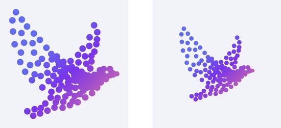
Because iOS and Android display icons differently, two separate versions are required.
- iOS: Only the corners are rounded.
- Android: A mask crops more of the image.
Tip: Keep your logo or artwork centred within approximately 600 × 600 px of the canvas to prevent important content from being cropped on Android devices.
Apple Android
👉 Where to upload in the studio: Go Community App > App building > Layout tab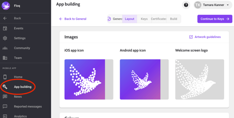
Google Play Store images
To submit your app to the Google Play Store, create the following images that represent your app:
- A square icon of 512x512px. You can resize the App icon for this.
- A feature graphic of 1024x500px
Both images should be PNG without transparency or shadow. Please note that the corners of the image will be automatically rounded, so important information should be kept from the e
Welcome screen
👁️ Where users see it: The welcome screen appears while the app starts and loads. Depending on the user's device, it is typically visible for 0–2 seconds.
✅ Requirements:
- Logo: 1024 × 1024 px
- PNG with transparency
The logo is displayed on top of your selected background colour (which is a single colour of your choice)
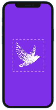
👉 Where to upload in the studio: Go Community App > App building > Layout tab
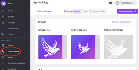
Confirmation and password reset email *
👁️ Where can users see it: If users can sign in using their email address, you can brand the automated emails they receive for email verification (to verify a user's email) and password resets (to reset their passwords).
✅ Requirements:
- Email header image: 900 × 450 px
- You'll also need to provide an hexcode accent colour (for example, #005EB8) used for buttons, links, and titles (in the example below: the color is the"Open the event" button)
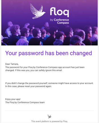
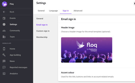
(this is done on a Community level/multi-event app level): Community/Society Level: Go to Settings > Click the Sign in tab > Scroll down to Email sign in > and add your chosen Header image.
Event banner
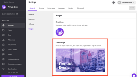
👁️ Where do users see it: The large required event banner (also known as large event tile) is used in the mobile app when the event is linked with a large tile, and in the web app when accessing the event through the event overview on Floq Live.
✅ Requirements:
- Required: Large event tile (1260x600px)
-
Medium event tile (600x600px)


This is what the large event image (event tile) looks like in the web app (left) and when the user initially opens the single event app.
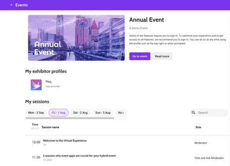
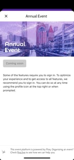
👉 Where to upload in the studio: Choose your event in your Community level in the studio > Click on Settings > Click on the General tab > Scroll down to Images > Upload your Event image.
Sign-in background
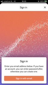
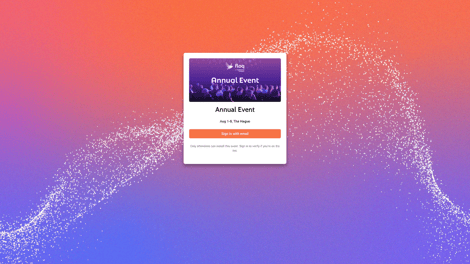
👁️ Where users see it: If a user signs in to the app, they see a full-screen image behind the section where they can sign in (sign-in form).
✅ Requirements:
-
1920 × 1080 px
- Avoid logos or text (use patterns, textures or photography without important details near the edges)
Because mobile screens vary in size, parts of the image may be cropped/corners may be cut-off
You can also apply the same sign-in background for all the events in your multi-event app (default background), click here to learn more.
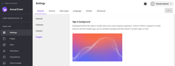
👉 Where to upload in the studio: Choose an event in your community app > Go to Settings > General > Scroll down to Images > Sign in background
Event icon (web only)
👁️ Where users see it: The icon will be displayed in the top-left corner of your web app.
✅ Requirements: icon 120 × 120 px
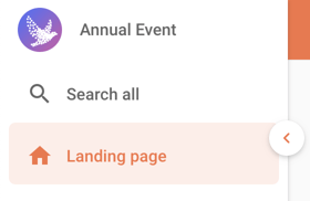
👉 Where to upload in the studio: Choose your event > Settings > General tab > Scroll to Images > Event icon (web only)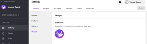
Invite email
👁️ Where users see it: The invitation emails that are sent from the attendee list directly to users emails, which are customizable.
✅ Requirements:
-
Header image (900x450px)
-
Hexadecimal (hex code) (e.g. #FFFFFF) accent colour used for titles, buttons, and links.
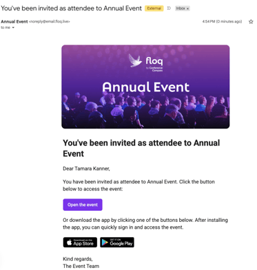
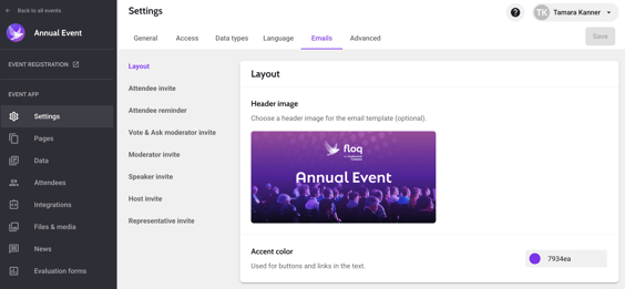
👉 Where to upload in the studio: Choose your event > Settings > Email tab > Scroll to Images > Event icon (web only)
Intro screens (mobile only)
👁️ Where users see it: Intro screens (also known as splash screen) are displayed when users open the event. You can upload multiple images and configure how long each one is displayed.
✅ Requirements:
-
Intro screen image 1080 × 1920 px
- Optional but recommended: a chosen hexcode background color
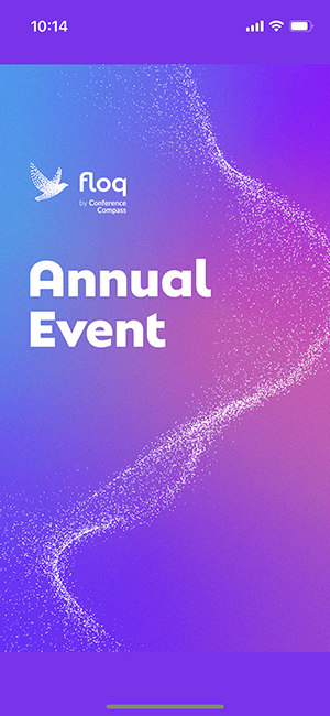
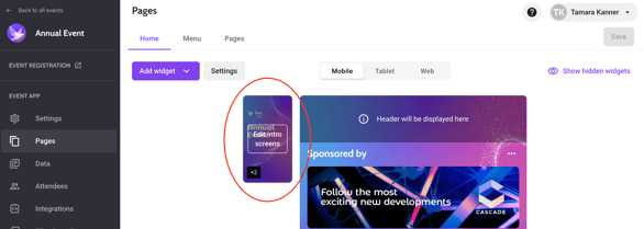
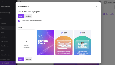
👉 Where to upload in the studio: Choose your event > Pages > Home > Select the intro screen button next to the Home page of the event app, then a popup will appear where you can choose multiple intro screen images.
Home page banner
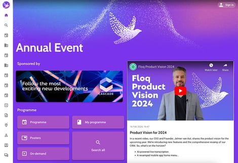
👁️ Where users see it: Displayed at the top of the event home page. You can choose to show the event name as text on top of this banner, like in the example below, but you can also add it to the image itself.
✅ Requirements: Different aspect ratios are needed for the different device types:
- Mobile: 1080 x 1080 px (1:1)
- Tablet: 1920 x 960 px (2:1)
- Web: 1920 x 480 px (4:1)
- Choose a customizable background colour (hexadecimal, e.g. #FFFFFF) that is shown below the image on the rest of the page.
Keep in mind: The top of the image is covered by the status bar and app navigation. Avoid placing logos or text there. For another example, check out the example on this page.
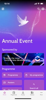
👉 Where to upload in the studio: Choose your event > Pages > Home > Select the device type (mobile, tablet or web) and when hovering on the home screen the text "Add/change page banner" will appear. 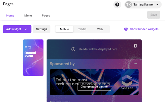
Navigation tiles
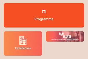
👁️ Where users see it: These are the main buttons displayed on the home page, and can be customized to fit the event branding. You can create the navigation tiles for the home page in the studio by selecting an icon and choosing a label, but you can also upload a custom image.
✅ Requirements: Different aspect ratios are needed for the different device types:
- Small tile – 600 × 200 px
- Medium tile – 600 × 450 px
- Large tile – 1260 × 450 px
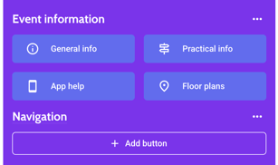
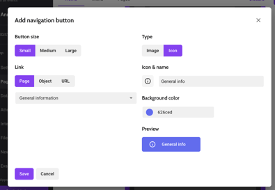
👉 Where to upload in the studio: Choose your event > Pages > Home > Add a Navigation widget > scroll down in your Home screen and click "Add button" > Connect your button to a page, and change the Type to Image to add an image for a button.
Already have a navigation widget and want to edit or add more buttons? Simply click the 3 dots (...) next to the navigation section to add a button to that section, or edit a button by hovering over one and clicking the 3 dots that appear. 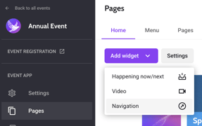
Large card in industry list
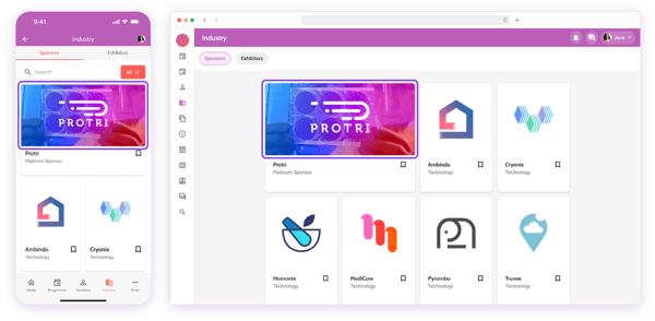
👁️ Where users see it: By default, institutes/sponsors will display a small card, which is automatically the logo image, but institutes have the option to appear on a large card with a customisable banner in the industry overview.
✅ Requirements:
- Large card 1200 x 600 px.
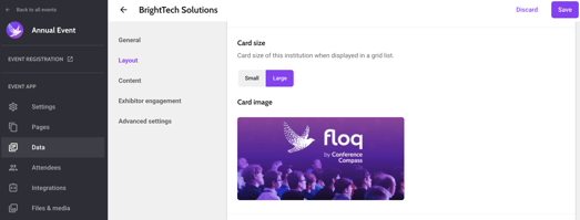
👉 Where to upload in the studio: Choose your event > Click on Data > Click on the institute/sponsor/exhibitor you would like to have a large image card > Scroll down to the Layout section > Go to the Card size section > Click the Large tab instead of the default Small tab > Then, Card image section will appear where you can upload your large card image.
News messages
👁️ Where users see it: Optionally displayed on top of a news message, which can be seen in the home screen and when you open a news message.
✅ Requirements:
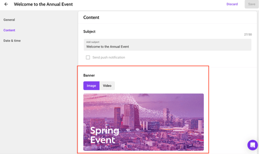
- There are no requirements for these images: recommended 1200 x 300 px
- Optional: This could also be a Youtube or Vimeo video (URL required)
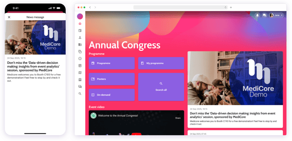
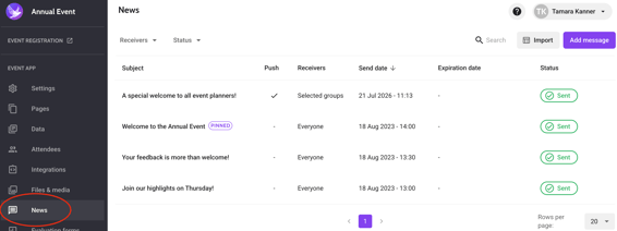
👉 Where to upload in the studio: Choose your event > Click News > Either add a message or edit an existing message > Scroll down to Content > Upload a Banner image or video URL.
Sponsor banner
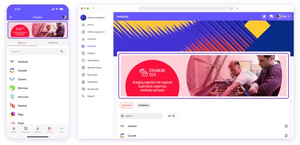
👁️ Where users see it: Displayed as a slideshow (sponsor banner widget) on the home page. You can have as many images and as many separate sponsor banners as you like.
✅ Requirements: Different aspect ratios are needed for the different device types:
- Banner 1260 × 450 px
- You can only add one banner at a time, so if you see the Sponsor banner widget button disappears, this is because it is somewhere in your home page!
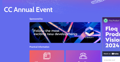
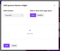
👉 Where to upload in the studio: Choose your event > Pages > Click Add widget > Choose Sponsor banner > Then go to where the Sponsor banner populated in the Home page and click Add image, from here you can add as many slides (banners) as you want.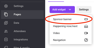
Banner above list or navigation page
👁️ Where users see it: Displayed above list and navigation pages as a slideshow (optional), you can add one or multiple banners.
✅ Requirements: Different aspect ratios are needed for the different device types:
- Banner image 1280 × 320 px
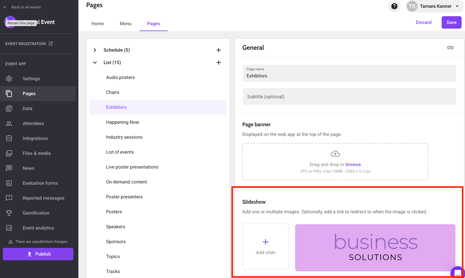
👉 Where to upload in the studio: Choose your event > Pages > then, click the Pages tab > Click on List where a dropdown will appear > click the list you want your banner to show (in this example it is Exhibitors) > Go to Slideshow and upload a banner of your choice!
Floor plans
👁️ Where users see it: When clicking on the "floor plan" button or when clicking a location through a programme item or institution, the floor plan will open.
✅ Requirements:
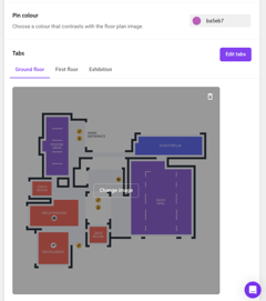
- Floor plan images 4000 × 4000 px (have multiple images for different floors or locations? That is possible to upload in different tabs!)
- Images only, no PDF's!
- Choose a customizable colour (hexadecimal, e.g. #FFFFFF) that is used for the pins when you link a location/place to the floor plan.
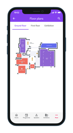
👉 Where to upload in the studio: Choose your event > Pages > then, click the Pages tab > Click on Floorplan > Scroll to Content > Tabs > Add a tab of your choice and upload your floor plan image > add a pin color by adding the chosen hexcode.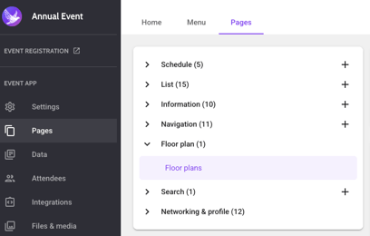
Session images
You can also add images to a session page: a logo above the session in the list, and/or a banner on the session detail page.
Sponsor logo
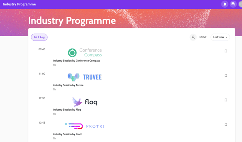
👁️ Where users see it: Appears above the session title within the Daily Programme.
✅ Requirements:
- 900 × 150 px
Note that the logo is not visible in table view layout.
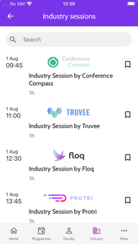
👉 Where to upload in the studio: Choose your event > Click on Data > Choose the Programme items tab > then, locate the session/presentation you would like to add the sponsor logo to > Click your session > Scroll to Images > Upload your Sponsor logo.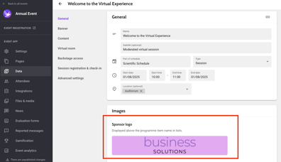
Session banner
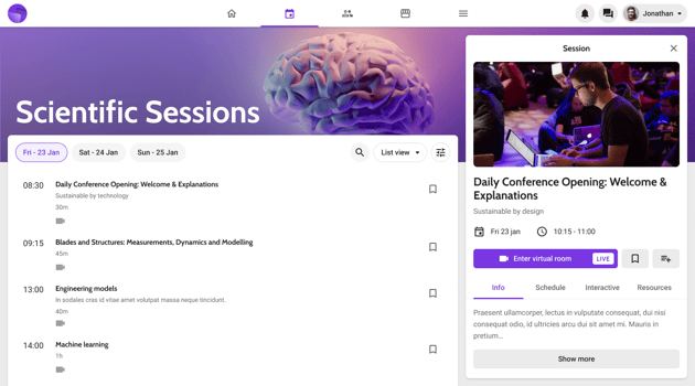
👁️ Where users see it: Appears at the top of the session detail page.
✅ Requirements:
- Banner 1200 × 600 px
- Optional: Vimeo or Youtube link to add a video
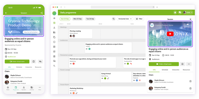
👉 Where to upload in the studio: Choose your event > Click on Settings > Click on Data types tab > Go to Programme items and select the item you want to display all the same banner (eg: all Sessions, or only all Posters, etc) > Scroll down to the Image section and upload your banner image.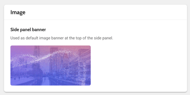
Want to change the banner per programme item? Choose your event > Click on Data > Choose the Programme items tab > then, locate the session/presentation you would like to add the session banner to > Click your session > Scroll to Images > Find Banner > Upload your Sponsor logo.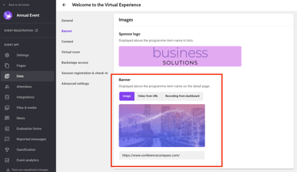
Profile images
Background
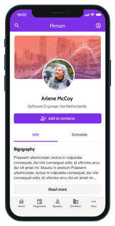
👁️ Where users see it: You can change the default background image behind all person profiles.
This image will be used for all person's pages in this event.
✅ Requirements:
- 1200 × 600 px
👉 Where to upload in the studio: Choose your event > Click on Settings > Choose the Data types tab > then, go to Persons > Go to Images > Find Background image and upload your image. 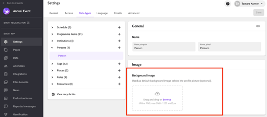
Profile picture
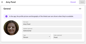
👁️ Where users see it: For presenter or speaker images, the image is seen when displaying the presenter/speaker/author of the session, and when the user clicks on a Persons profile.
✅ Requirements:
- 1200 × 600 px
- Faces should be centred, as profile pictures are displayed inside a circular frame.
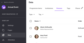
👉 Where to upload in the studio: Choose your event > Click on Data > Choose the Persons tab > then, choose the Person you want to upload a profile picture for and click on their profile> Go to Images > Upload the persons profile picture here.
Page banner (web only)
👁️ Where users see it: Displayed above Daily Programme, Navigation and List pages.
✅ Requirements:
- 1920 × 384 px
-
You can include the page title in the artwork or use the Floq Studio setting to display the page name.
👉 Where to upload in the studio: Choose your event > Click on Pages > Choose the Pages tab > Go to General > Choose and upload your Page banner.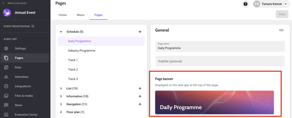
Virtual rooms - Placeholder images
Placeholder slide frame & speaker frame
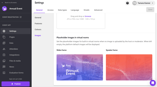
👁️ Placeholder slide frame - Where users see it: A placeholder image for slides in a virtual room in the branding of your event. When no slides are being shared, this image is the placeholder instead. Great to use for sponsored sessions!
👁️ Placeholder speaker frame - Where users see it: This placeholder image can be seen in a virtual room in the branding of your event where the speaker should be displayed. When no video camera on the speaker is shared, this image is the placeholder instead
✅ Requirements:
- Placeholder slide frame 1280 x 720 px
- Placeholder speaker frame 1280 x 720 px
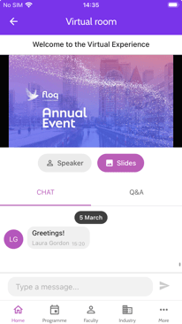
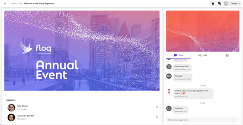
👉 Where to upload in the studio: Choose your event > Click on Settings > Click on the General tab > Scroll down to Images section > Find the Placeholder images in virtual rooms section and upload your image in Slides frame or Speaker frame.
Virtual room banner
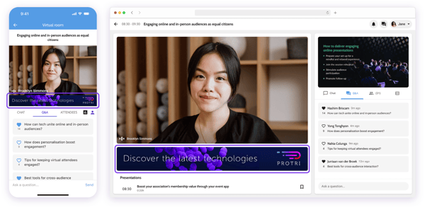
👁️ Where users see it: You can add a unique banner in each virtual room which will be displayed below the slides frame. The image could be linked to an object or page in the app, or an external URL.
✅ Requirements:
- Sponsor Banner 1280 x 160 px.
Note: This can only be added individually per programme item, therefore you can add the sponsor banner one by one per specific session.
👉 Where to upload in the studio: Choose your event > Click on Data > Click on the session/poster/presentation you would like to add a sponsor banner to > Go to Scroll down to Virtual room section > Upload your image in the Sponsor banner section*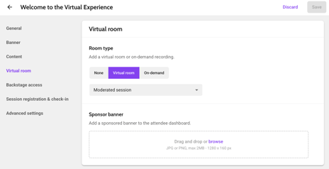
*This is not the same as Sponsor logo. To know the different, click here.