This article describes how the data in your event is structured and how you can add your event data manually.
The information you want to show for an object, is fully flexible and can be configured in the data structure. In the data structure, you can configure the sections for each type. Within a section, you can add 'links' to other data objects.
We are gradually updating all Floqs to a new version in which the data types, data editors, integrations and releases are completely revamped. If your Floq is already on the new version, refer to the new article about the adding and editing data.
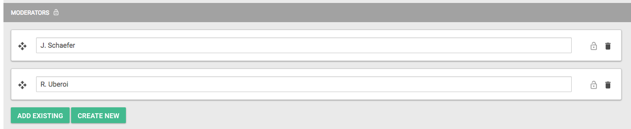
Add objects to section
When creating links by adding objects to sections, there are two workflows:
-
If you've already added all program items, persons, topics, institutions, etc., but have not linked them yet, you can click Add existing. A new field appears, in which you can either start typing the name of the object (program items, posters, institutions, persons, places), or select the object from a dropdown (classifiers).
-
If you haven't added all data yet, you can add it directly from the section. Click Create new and select or enter the data of the new object. The new object will automatically get the right type, based on the section it is created in.
Bi-directional relations
Relations between objects are bi-directional and can be created in two ways. You can for example assign a topic to a presentation by:
-
Adding the topic in the section Topics on the related presentation details page
-
Adding the presentation in the section Presentation on the related topic detail page.
When creating the relation in one way, the other way is also automatically linked and a section for it will appear in the objects of that type. If you don't want to display the 'inverse' section in the app, you can mark it as hidden.
Move objects in sections
If there are multiple options in a section, you can drag them in the right order with the arrows on the left.
Delete objects from sections
To delete an object from a section, click the trashcan. If you've accidentally deleted it, you can always get it back by adding it again: the object itself is not deleted, just the link.
Data categories
The data you can add should be part of one of these categories:
- Programme items: all items that relate to the daily program and have a set start and end time.
- Posters: posters or other items that are part of the program, but do not have a start and end time. They can however be part of program items that do have this.
- Institutions: sponsors, exhibitors or other organisations that in some way are part of your conference.
- Persons: all authors, speakers, moderators, etc. that contribute to your conference. You can link these to program items, for example to set a speaker for a certain presentation.
- Classifiers: properties that can be assigned to any of the other data types or to other classifiers to group them. Think about linking a topic to a presentation or secondary topics to main topics.
- Places: Places can be indicated on your floor plan. They can be linked to program items or institutions, to show users where these are located.
Programme items
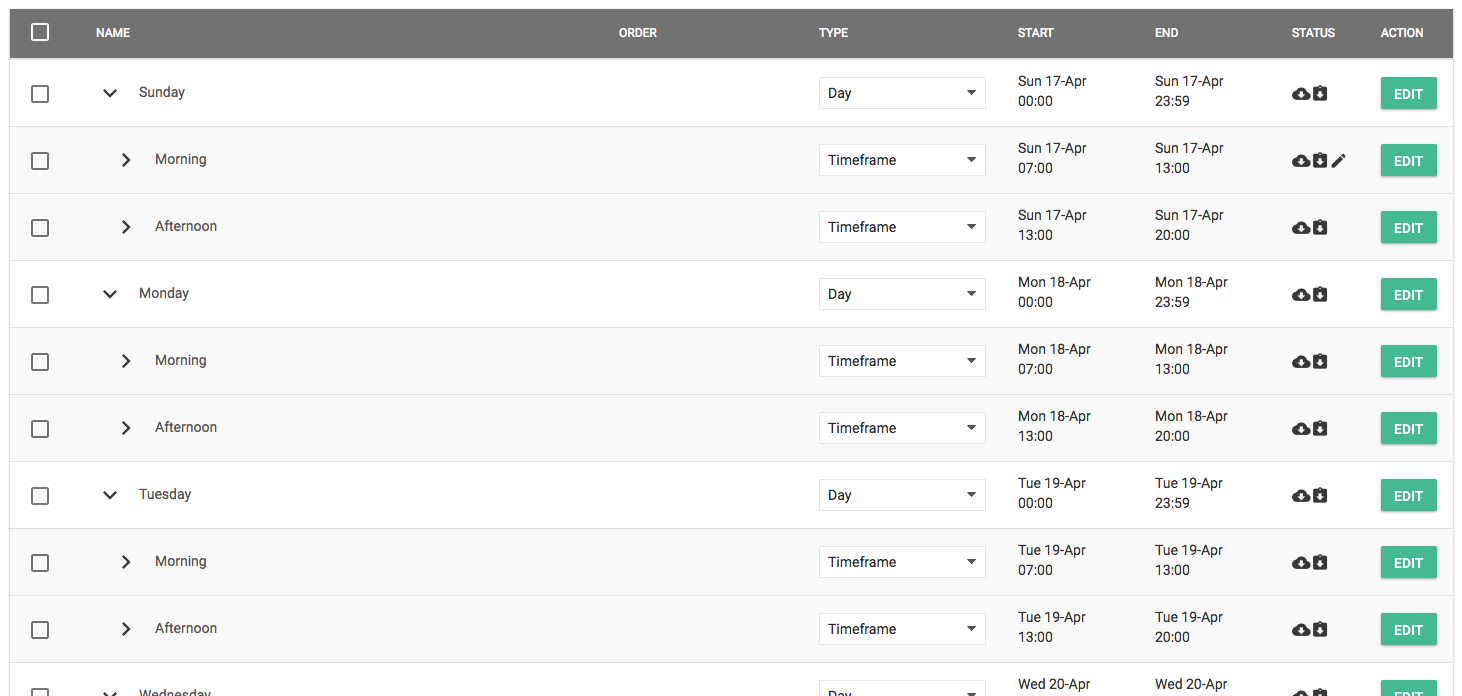
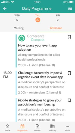
Programme items that are configured correctly, will automatically appear on your daily program page. We use a hierarchical structure, where you can 'nest' items under other items. This hierarchy is usually: Day - Timeframe - Session - Presentation. In the default template, these types are already created, so you only need to add items to them and link them correctly to other objects.
- Days: Start by creating items for the days on which your conference takes place. Go to the Data page, Program items tab and click Add program item. Enter the following data:
-
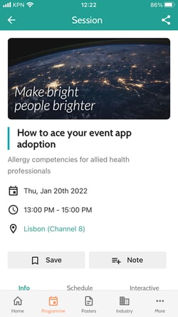
Name: this name will appear in the top slider of the programme, in the example above Saturday 10 September.
-
Type: as you're configuring a day here, select Day.
-
Start/End: select the start and end date of your day, usually 00:00 - 23:59. This is just for your own administration and not displayed anywhere.
-
The rest of the fields can remain empty. Click Create to create the object. The detail page will be opened. As no more needs to be filled in here, click Save & Close. Repeat this process for all your conference days.
- Timeframes: After the days, create the timeframes. These are the parts of the day that will narrow down your program, in order to allow users to more easily find what they are looking for. Click Add program item again and enter the following details:
-
-
Name: this name will appear in the tabs or headers of the programme, in the example above Morning and Afternoon. Please note that you can have multiple timeframes with the same name, e.g Mornings, that all take place on a different day.
-
Type: as you're configuring a timeframe here, select Timeframe.
-
Start/End: select the start and end date of the timeframe. Even though it's not displayed to users, make sure you set the correct date and time here, as you need it to be able to link sessions to the right timeframe.
-
The rest of the fields can remain empty. Click Create to create the object. The detail page will be opened. To make sure the data will be displayed correctly in the program, add the right Day below Nested under.
Click Add existing and start entering the day name this timeframe is part of. Click to select the day and click Save & Close.
Repeat this process for all timeframes on all days. After doing so, take a bit of time to check in the overview if you've configured all your days and timeframes correctly.
- Sessions and presentations: Now that the basic structure is set up, you can start adding your sessions and presentations. Click Add program item and enter the basic details of your session or presentation:
-
-
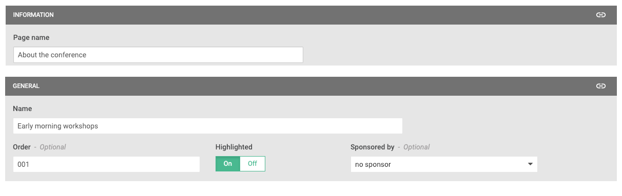
Name: the name of the program item.
-
Order (optional): items that start and end at the same time, are normally displayed in a random order in the daily program. This field can be used to define an order for those items. Enter a low number for the item you want to display first, and higher numbers for items below that.
-
Highlighted: program items that have this set to On, will be displayed in the program in the highlighted colour. This colour can be set in Settings > Colours > Highlighted.
- Type: choose the selected Type, e.g. Session, Interactive Session or Presentation.
-
Start/End: set the start and end date and time. The items in the program are automatically sorted based on the start time. If items start at the same time, the ones ending earlier are displayed first.
-
Subtitle in lists (optional): choose the subtitle you want to display in lists, e.g in the programme overview or the list of presentations below a session.
-
Subtitle in headers (optional): choose the subtitle you want to display on the detail page of an object.
- Poster file: click here for all info.
- Sponsor logo (optional): the logo added here is shown in the program item card on the web app.
-
Sponsor logo in lists (optional): the logo added here is shown above the program item when it is shown in a list.
- Poster file: the first page of the PDF uploaded here is used as a thumbnail when the programme item is displayed in a grid list.
- Banner on detail page (optional): you can add a banner that is visible above the title on the detail page of an item. Next to an image or video (YouTube or Vimeo), you can select Video: Recording in host dashboard. The Introduction Video made by the host will then be displayed.
- Banner in virtual room (optional): you can add a banner to appear in the virtual room, right below the big slides frame. Optionally, you can set a link to it. This link opens when the banner is clicked.
 .
.  .
. -
After clicking Create, the detail page opens. Here you can add more data to the program item. Don't forget to click Save & Close after you're done!
-
-
URL for banner: If you've uploaded a banner, you can set a link to it. This link opens when the banner is clicked.
- Virtual session: choose whether a virtual session or on-demand recording is available for this session. If you choose one of those options, you can specify whether you want to use the built-in room or recording or an external URL.
-
Info: here you can add extended info to the program item. You can use the HTML editor to format the text and to add links, images and video's. By clicking the pencil top right, you can change the data structure that defines whether the info should be visible in the app and what it's name should be. Please note that when editing this, changes are applied to all objects of the same type.
-
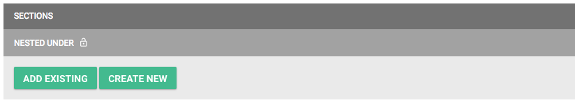
Nested under: in order for an item to appear in your program, it has to be nested under another item. This can be a Timeframe, or another program item. Start by entering the name of the parent item and click to select it.
-
Other sections: besides Nested under, there are probably other sections defined in your data structure to which you can add data. For more info on how to add data to sections, see the beginning of this article. To change the sections, you have to change the data structure by clicking the pencil top right. Please note that when editing this, changes are applied to all objects of the same type.
-
Posters
To add a poster, go to the page Data, tab Posters and click Add poster. Enter its basic details:
-
Name: the name of the poster.
-
Order (optional): if multiple posters are nested under the same program item, their order is default alphabetical. This field can be used to define another order for those items. Enter a low number for the item you want to display first, and higher numbers for items below that.
-
Highlighted: posters that have this set to On will be displayed in lists in the highlighted colour. This colour can be set in Settings > Colours > Highlighted.
-
Type: choose the selected Type, e.g. Poster.
-
Subtitle in lists (optional): choose the subtitle you want to display in lists, e.g in the programme overview or the list of presentations below a session.
-
Subtitle in headers (optional): choose the subtitle you want to display on the detail page of an object.
- Poster file: click here for all info.
- Banner on detail page (optional): you can add a banner that is visible above the title on the detail page of an item. Next to an image or video (YouTube or Vimeo), you can select Video: Recording in host dashboard. The Introduction Video made by the host will then be displayed.
After clicking Create, the detail page opens. Here you can add more data to the program item. Don't forget to click Save & Close after you're done!
- URL for banner: If you've uploaded a banner, you can set a link to it. This link opens when the banner is clicked.
- Virtual session: choose whether a virtual session or on-demand recording is available for this session. If you choose one of those options, you can specify whether you want to use the built-in room or recording or an external URL.
- Nested under: if you want the poster to appear in your daily program, it has to be nested under a program item. Start entering the name of the parent item and click to select it.
- Other sections: besides Nested under, there are probably other sections defined in your data structure to which you can add data. For more info on how to add data to sections, see the beginning of this page. To change the sections, you have to change the data structure by clicking the pencil top right. Please note that when editing this, changes are applied to all objects of the same type.
Institutions
Go to the page Data, tab Institutions and click Add institution. Enter its basic details:
-
Name: the name of the institution.
-
Order (optional): if you don't enter an order, institutions will be sorted alphabetically in lists. If you want them sorted in another way, choose in the settings when creating a list page to sort first by order and then by name. Then enter a low number for the item you want to display first, and higher numbers for items below that.
-
Highlighted: institutions that have this set to On, will be displayed in lists in the highlighted colour. This colour can be set in Settings > Colours > Highlighted. You can then also link a sponsor page to the item, so that when users click it in the list, the sponsor page will open instead of the general institution page.
-
Type: choose the selected Type, e.g. Sponsor or Exhibitor.
-
Subtitle in lists (optional): choose the subtitle you want to display in the overview of institutions.
-
Subtitle in headers (optional): choose the subtitle you want to display on the detail page of an institution.
- Card size: if you use the grid view for a list, you can choose whether you want this institution to show as a small or a large card.
-
Logo (optional): upload the logo of the institution. The preferred image size is 600x600px, as it is displayed in a square in the app. You can also upload other formats, they will be resized to fit into the center of this square. If you choose the Small card size, this image will be used.
-
Background image / Banner on detail page (optional): depending on the setting that's chosen in the data structure, the image uploaded here is either used as background behind the logo, or as banner. The preferred dimensions of the file are 1200x480 px. If your image is another size, you can crop it to the right size after selecting it.
- Website URL: add the URL of the insitution
- Video: add a video to appear on the Info tab in the booth or side panel.
- Contact links: add the phone number, email address and social media links. They will appear on the Contact tab in the booth or side panel.
- Drop business card feature: choose whether you want to allow people to leave their business card. This feature is only available when you use the exhibitor booth layout and will send the details of the user that is signed in on web or mobile app. If it's on, you need to specify an email address the business cards will be sent to.
After clicking Create, the detail page opens. Here you can add more data to the institution. Don't forget to click Save & Close after you're done!
-
URL for banner: when you have uploaded a banner, you can specify a URL. This link opens when the banner is clicked in the app. You can also link to pages within the app. You can find this URL, that starts with cc://, below the link icon top right in for example pages or data objects.
- Card image: if you choose a Large card size, this image should be uploaded.
-
Info: here you can add extended info to the institution. You can use the HTML editor to format the text and to add links, images and video's. By clicking the pencil top right, you can change the data structure that defines whether the info should be visible in the app and what its name should be. Please note that when editing this, changes are applied to all objects of the same type.
-
Slideshow images: you can add images that will appear right below the info on the institution page. The first one is displayed upon opening. If you add multiple images, users can swipe to see the next images. Add an image by clicking the Add image button and then Add image in the image block. The preferred dimensions of the file are 1200x480px. If your image is another size, you can crop it to the right size after selecting it.
-
Other sections: there are probably other sections defined in your data structure to which you can add data. For more info on how to add data to sections, see the beginning of this page. To change the sections, you have to change the data structure by clicking the pencil top right. Please note that when editing this, changes are applied to all objects of the same type.
Persons
To create an overview of all persons in your event, see the topic on how to create list pages.
To add a person, go to the page Data, tab Persons and click Add person. Enter its basic details:
-
Name: the name of the person.
-
Order (optional): if you don't enter an order, persons will be sorted alphabetically by their full Name in lists. If you want them sorted in another way, choose in the settings when creating a list page to sort first by order and then by name. Then enter the Order here, for example enter the last name.
-
Type: choose the selected Type, mostly Person.
-
Profile picture (optional): here you can add a profile picture to a person. You can select an image from the image library with the dropdown (only images in the category Persons are shown) or add a new one by clicking Upload new image and then Select image. The preferred dimensions of the file are 600x600 px. If your image is another size, you can crop it to the right size after selecting it.
-
Subtitle in lists (optional): choose the subtitle you want to display in the overview of persons.
-
Subtitle in headers (optional): choose the subtitle you want to display on the detail page of a person.
- Linked user (optional): with this option, you can link a user from your attendee list to this person. When in the mobile or web app, a user is viewing the profile of this person, they will see the user profile as the person has created that herself, and can send them a contact request or a chat message. If she's not linked, you will see the info that is entered above. Please note that the link remains visible in the web and mobile app until the attendee is removed from the attendee list.
After clicking Create, the detail page opens. Here you can add more data to the person. Don't forget to click Save & Close after you're done!
-
Info: here you can add extended info to the person. You can use the HTML editor to format the text and to add links, images and video's. By clicking the pencil top right, you can change the data structure that defines whether the info should be visible in the app and what its name should be. Please note that when editing this, changes are applied to all objects of the same type.
-
Other sections: there are probably other sections defined in your data structure to which you can add data. For more info on how to add data to sections, see the beginning of this page. To change the sections, you have to change the data structure by clicking the pencil top right. Please note that when editing this, changes are applied to all objects of the same type.
Classifiers
Classifiers can be used to group data. Some examples:
-
create overviews of program items per topic or session type
-
add the product categories to institutions as a reference for users
-
display your sponsors grouped on bronze, solver and gold levels
Before adding classifiers, make sure the types you want to create them for are added in the data structure. If you're for example planning to add topics to program items, make sure that in the Classifiers, you have created the type Topic.
To add a classifier, go to the page Data, tab Classifiers and click Add classifier. Enter its basic details:
-
Name: the classifier name.
-
Order (optional): if you don't enter an order, classifiers will be sorted alphabetically in lists. If you want them sorted in another way, choose in the settings when creating a list page to sort first by order and then by name. Then enter a low number for the item you want to display first, and higher numbers for items below that.
-
Type: choose the selected Type, e.g. Topic, Session Type or Product Category.
-
Color (optional): if you assign a colour to a classifier, a bullet with this colour is displayed below the title of the items that have this classifier in lists, and for programme items on the cards in the daily schedule. In the data tables in the configurator, you can also easily recognise them by this colour.
-
Icon (optional): similar to colours, you can also add icons. These will appear on the colored bullet. If you didn't add a color, the background will be white.
After clicking Create, the detail page opens. Here you can add more data to the institution. Don't forget to click Save & Close after you're done!
-
Info: here you can add extended info to the classifier. You can use the HTML editor to format the text and to add links, images and video's. By clicking the pencil top right, you can change the data structure that defines whether the info should be visible in the app and what its name should be. Please note that when editing this, changes are applied to all objects of the same type.
-
Other sections: there are probably other sections defined in your data structure to which you can add data. For more info on how to add data to sections, see the beginning of this page. To change the sections, you have to change the data structure by clicking the pencil top right. Please note that when editing this, changes are applied to all objects of the same type.
Places
There are two workflows to add your places and link them to a location on the floor plan:
-
First add all places, and then set their locations. This is also the workflow when your places are imported from an external source (channels, Excel-files) or when you add your places before your floor plan image is available.
-
One by one add a place and its location. This is convenient when your floor plan image is available and you already know where all places are located.
Before you can set the locations, make sure your floor plans are uploaded to the floor plan page.
To add a place, go to the page Data, tab Places and click Add place. Enter its basic details:
-
Name: the name of the place.
-
Order: optionally, you can specify an order for the places. This will determine the order of the rooms in the list on the floor plan page in the app and in the daily programme of the web app.
-
Type: choose the selected Type, e.g. Rooms or Booths.
-
Location: click Add to open a window with the uploaded floor plans. Select the right floor plan tab and click in the image to place the pin. Save by clicking Set. When you'll do this later, you can leave it empty.
-
Exhibitor: if you link an institution to a place, clicking on the pin on the map in the app will bring the user to the detail page of that institution.
Click Create and then Save & Close to return to the overview. You can skip the step above if your places are imported.
Set multiple locations at once
In the table overview of all places, select those for which you want to define the location. You can filter the table on Location set: no to only see the places for which you didn't set a location yet.
Click Place pins on floor plan. In the window that opens, select a place on the right and click in the floor plan to place its pin. If you have added multiple floor plans, you can click the tabs to select the right one. After you're done, click Set all. All placed pins are saved.
Edit data
Edit one item
Simply click Edit in the table overview of the Data page. You can change the fields as described above.
Edit multiple items
To edit multiple items at the same time, select the items to edit and click Edit selected above the table. Depending on the type of object you are editing, the following options are available
-
Type: you can only change the type if you've selected items of the same type.
-
In event program nested under: change the program item under which the selected items should appear (programme items and posters only).
-
Start/End: change the start or end date of the selected items (programme items only).
- Ordering: change the order of the selected items (classifiers only).
-
Lock status: change the status to Locked if you're importing data from external sources (channel, Excel) and you don't want the items to be deleted or edited. Select Unlock to release this.
Delete data
Delete one item
Open the item and choose Delete from the top right. You'll be requested to confirm deletion.
Delete multiple items
Select the item(s) to delete in the table overview of the Data page and click the button Delete selected in the toolbar. You'll be requested to confirm deletion.
Restore deleted data
If you've accidentally deleted an item in your Event, you can restore it through the recycle bin. To view all items in the recycle bin, click View recycle bin at the bottom left of the table.
This shows you all deleted items of the selected category. The cells in the table are disabled, as deleted items cannot be edited.
To restore one item, click Restore at the right of the row. To restore multiple items, select them with the checkboxes and click Restore in the toolbar. They are moved back to the 'normal' data overview.
Poster file
A poster file can be uploaded to programme items and posters.
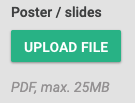
Turn on Make poster/slides file available to attendees in the data structure to make the file uploaded here available on the app. It will then be shown:
- When you haven't set the room to be virtual, and you have not invited a host, it will open as a PDF from either the View poster / slides button in the side panel, or the link below Poster/slides on the Resources tab.
- When you did set the room to be Poster presentation or round-table session, and you have invited a host, it will be shown in the on-demand room that can be opened from either the View poster / slides button in the side panel, or the link below Poster/slides on the Resources tab.
- When you did set the room to be Poster presentation or round-table session, you have invited a host, and the host has started the meeting, the PDF is shown in the slides frame to the participants.
- If the poster list is in grid view, a thumbnail of the poster will be shown as a preview.