You can set up the home page of the mobile app below Pages & Layout, in the Home tab. This article explains how.
We are gradually updating all Floqs to a new version in which the home, menu and pages are completely revamped. If your Floq is already on the new version, refer to the article about setting up the home page and menu.
There are four main parts to set up: the news feed background, the buttons, the banners and the colors.
Add a news feed background
The news feed background image appears behind the messages in the feed on the home menu screen.
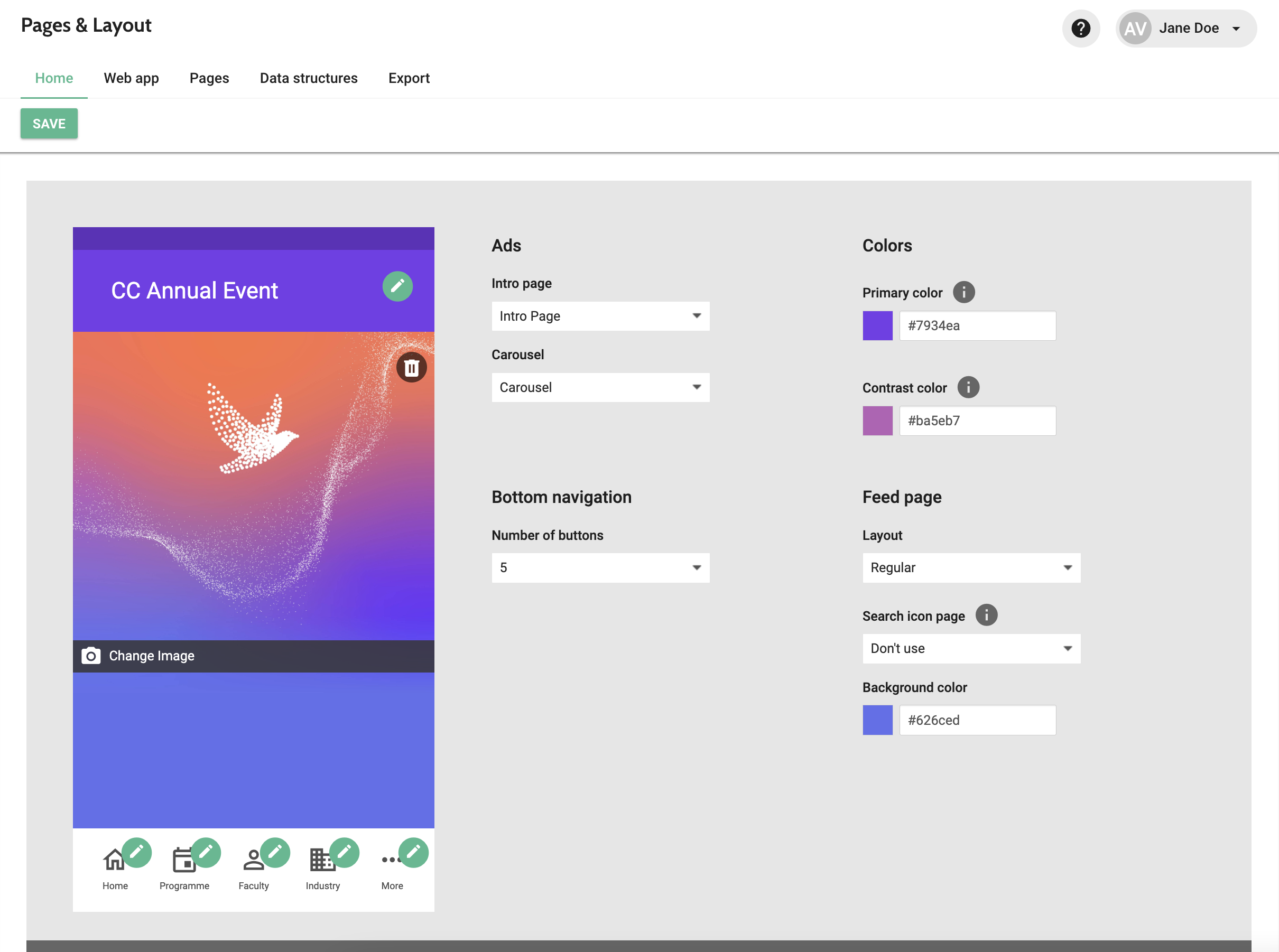
To add a background, click Add image at the bottom of this preview. When you have already added an image before, this text is Change image. A window opens where you can select your image. The image size is specified in the Artwork Guidelines. After saving your image, the preview is automatically updated. The color that should be used below the image can be set below Background color.
Besides the image, you can also choose the layout of the page: Regular or Compact. This defines the distance between the title bar and the first message; or how much of the image is visible. Regular shows about half of the image, while for Compact it's only a small margin.
Set up your navigation buttons
The buttons on the navigation bar are the base of your app.
Set number of buttons
Before you start configuring icons and links, make sure you have selected the right number of buttons. You can choose between 4 or 5.
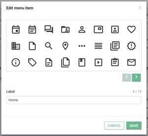
Choose icons
After choosing the number of buttons, you can start configuring the icons. Click the pencil at the top right of an icon and choose Edit icon.
In the dialog that opens, you can choose an icon from our library and enter a label that appears below it. Make sure to keep the label short, as only 1 line of text is available.
Please note that the colors of the icons cannot be set: they are default grey, and the selected icon has the contrast color.
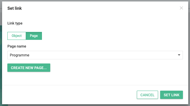
Set links
The first icon always links to the news feed, so for that one the destination cannot be set. For other icons, click Set link to change where the button will redirect to.
You can link either to objects or pages:
-
Object: this is the detail pages of an individual item, for example of a certain session or person. To link to an object, start entering the name and click to select the object as soon as it appears. When you haven't added your data yet, links like this cannot be set. You could then temporarily link to a page and add the right link when the data is there.
-
Page: the list contains all pages that have been configured in the Pages & Structure page, Pages tab, sorted by type. Any template comes with a number of these pages. If the page you want to link to is not there yet, you can easily create a new one by clicking Create new page.
Add banners
Below the section to set up the home screen layout, you can find a section to add banners. These banners appear above the first news message in the feed as a slideshow, and can be used to promote for example sponsors, sessions, or related events.
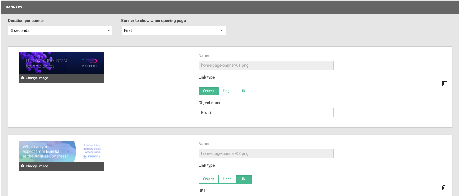
Banners can be added with the + button, and can be removed with the Delete icon.
General settings
-
Duration per banner: determines how long each banner is shown before moving to the next one. You can choose a duration between 1 and 7 seconds.
-
Banner to show when opening page: options here are First or Random. If set to First, the first banner in the list below is always shown when opening the page. This setting can be useful if you've made a price distribution for your sponsors. The one that paid the most, is then shown the most. If you set it to Random, either of the banners below are shown first when opening the page. This means that on average, each sponsor will be the first for the same number of times.
Settings per banner
-
Image: add the banner image here. You can find the artwork requirements for the banners in our guidelines, below News feed banners.
-
Name: this name is used in the analytics.
-
Link: choose what type of page you want to link to: Object, Page, or URL. Below it, you can select or enter the actual destination.
Choose the event colors
At the top right of the page, the following colours can be set:
-
Primary colour: this is the main colour of you app that is used for the app bar and primary headings in information pages.
-
Contrast colour: the contrast colour is mostly used for contrasting elements in the app, such as icons or buttons.