Release notes Q4 2024
This article contains the release notes for the releases of the Floq.live web app, mobile app and Floq Studio done in Q4 2024.
16 December 2024
Features and improvements
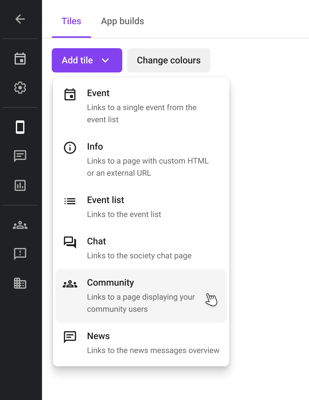
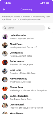
- On the society screen, you can now add a Community tile. On the mobile app, this tile will open a list of all users that have signed in to the app and have opted in to be visible in this list. From the list, users can access other users' profiles and can start a private chat.
 .
. 
- You can now also add a website URL and website name for institutions with the layout type side panel. Before, this was only possible for booths.

- The data tables and detail pages now load much faster.
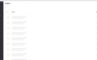
- While the list of releases or channel runs is loading, a so-called skeleton loader is shown instead of the placeholder. This makes it more clear that the page is still loading.
Bug fixes
- When setting locations on the floor plan in the studio, locations with long names are truncated so that they no longer overlap.
- Adding or changing the URL of a sponsor banner now enables the Save button. Before, it didn't, so you could not add or change the link the banner would redirect to.
- In the studio, the preview of the sponsor banner is no longer overlapping other tiles.
2 December 2024
Features and improvements
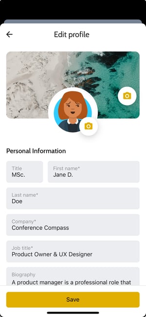
- When editing your profile on the mobile app, also when being onboarded, the Save button is visible right away. The profile fields scroll away underneath it. This way you don't have to scroll all the way down to save your profile.
Bug fixes
- Grouping lists by a tag is (again) supported on mobile. This was missing after implementing support for the new pages.

- When you're in a session chat, and the device falls asleep, your messages are sent correctly after you wake it up again.
26 November 2024
Features and improvements
The Pages item in the side menu, where you can set up the pages and layout of your mobile and web app, is completely revamped. It consists out of 3 tabs: Home, Menu and Pages, for which more details are described in the next paragraphs.
Home
On this tab, you can configure the first page attendees see when opening your app. You can now create a page featuring tiles and widgets for the mobile app, expanding the functionality previously available only for the web app.
At the top of the page, you can toggle between different layouts for different device types: Mobile, Tablet, and Web. When you add a widget, it automatically becomes available across all three layouts. However, you have the flexibility to customize the order of these widgets to suit your needs—for instance, using the web app before the event and the mobile app during the event.
You can add different types of widgets to your landing page with the Add widget button at the top left.

- News feed: this is a section that shows all available news messages within this event. Please note that due to the fact that these can be many, the widget has a fixed position: at the bottom of the page on the mobile layout, and at the right on the tablet and desktop layout.
- Sponsor banner: before, a sponsor banner was linked to the news feed and always shown above it. Now you can add it as a separate widget and place it anywhere on the page

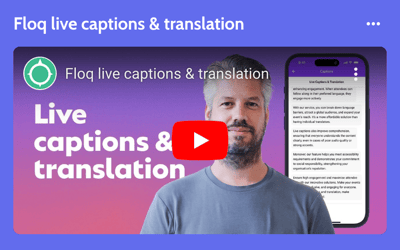
- Video: this widget will add a preview of a YouTube or Vimeo video as a tile on the landing page. It can be played from there. This widget was already available for the web app, but is now also supported on the mobile app.
- Happening now: for this widget, you need to select a Happening now page. The widget will then be a tile containing the first 2 sessions on this page and a button to view the entire page. This widget was already available for the web app, but is now also supported on the mobile app.
- Navigation: this will add a 'navigation' section to your web and mobile app, to which you can add buttons. These buttons can be small, medium or large, and can display an icon and label, or an image. They can be linked to a page or object in your app or to an external URL. A similar widget was already available for the web app, but this new version allows for more flexibility as the buttons can be moved and reordered within the widget. Additionally, it is supported on the mobile app as well. You can add as many navigation widgets as you want, and you can add as many buttons in a widget as you want.

All widgets display a title that can be edited by clicking on it, or turned off by clicking the option Hide title from the More (...) menu. If it's hidden, it will still be displayed as greyed out in the studio, but will not be visible in your app.

Through the Settings button, you can choose a few general layout options for your app, such as the title, background colour and whether to use a gradient between the image and the background. You can also add a search icon in the app bar and select the search page that should open when the icon is clicked.

The intro pages (only available for mobile and tablet) can be configured by clicking the Add intro screens placeholder or the small thumbnail at the top left of the device preview.
The header image can be set by clicking the Add page banner placeholder when none is set yet, or the Change image button that appears when hovering over the image. The top part of the image will be covered with (on mobile) the status bar, event title and some icons so make sure to not put any important content there.

Menu
On the Menu tab, you can set the menu of the web and kiosk app on the left and the bottom navigation of the mobile app on the right.

In the Web section you can, just like before, choose between using a side menu or top menu. When using Side menu, you can configure it below Menu items. Click Add new to add another item or click the ... icon that appears when hovering over an existing one to edit it. For every item, you can choose an icon, label and a page or object to redirect to.

When choosing Top menu, the same items as on the mobile app are used. The items for the Mobile bottom navigation menu can be set up the same way.
Below Web, there is another section Kiosk where you can configure a 'kiosk' version of the web app that doesn't have the options to sign in or favourite items. This can for example be used to embed on another website or to put on a display on-site. You can set it up the same way as the other menus. Optionally, you can add a password to it, for example if you only want to use it for displays on-site.
Pages
On the tab Pages, you can set up the different types of pages you can refer to in your app. Each page has a shared section General, where you can set the page name and subtitle, choose a page banner image and restrict access to the page. In the Content section, you can set the properties of the page. Most options available for a page are the same as in the old version; the changes are described per page type below.
- Schedule: on this page you can set up your daily programme page. The available options are similar to the previous pages. Below Timeframes, you can choose the start and end time of the timeframes that are displayed as tabs on the mobile app.
- List: here you can set up all kinds of lists: posters, exhibitors, speakers, etc. You can filter the list on a type, tag or role. Options are similar to what they were, but the following changes are important to know:
- Below Content, you now first need to choose a List type: Institutions, Persons, Programme items or Tags. Based on this, only the relevant available options are shown.
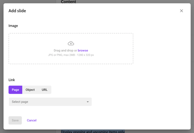
- A new option that is available is to add a slideshow above the list. This can for example be used to add sponsor banners above a list of exhibitors. Requested dimensions are 1280x320px (4:1). Optionally, you can link a slide to a page, object or external URL.
-
- Happening now pages no longer have their own page type, but are now also set up as a list page. Just choose Programme items below List type and turn on the toggle of Display ongoing and upcoming items only.
- Information: for information pages, you can toggle between using the WYSIWYG (What You See Is What You Get)-editor, or entering your own custom HTML if the options from the editor are not sufficient.
- Navigation: the options for the layout and the menu items themselves are similar to what they were. A new option is to add a slideshow above the page. Requested dimensions are 1280x320px (4:1). Optionally, you can link a slide to a page, object or external URL.
- Floor plan: the layout of the page is quite different, but the options are similar: you can choose what place types you want to shown on the floor plan and rename the tabs.

- Networking: this is a new category that contains the event feed and the attendee list. You cannot add or remove pages to this category, but you can rename them and set access restriction. These Networking pages will appear between the other pages in any list where you can select a page, for example when setting up a menu or a navigation page.

- Search: new to this page is that you can select all types of a certain category with one click.

Please note that the Intro and Carousel pages are no longer a page type, as they can be added on the Home tab.
Other
-
The checkbox Protect with password is always visible in the Access tab in the event settings, also when the event status is still set to Coming soon.

Bug fixes
- In the recording of moderated sessions, the placeholder image is no longer shown behind the speaker and slides frame. Instead, the background is black.
- On the chat presentation screen, new messages are now always visible right away. Before, you'd have to refresh the screen to see them in some cases.
- When creating a template from the event list, the content of information pages is included too. When using that template for another event, the same pages are available. Before, the pages were there but empty.
- When no channels are added, the button Run channels is not shown.
- Trying to zoom in to an image in the studio while cropping it now works as expected.
1 October 2024
Features and improvements
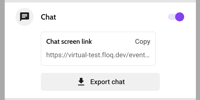
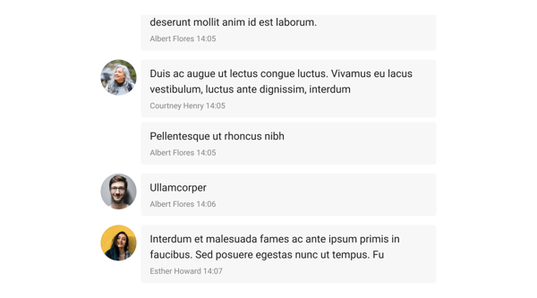
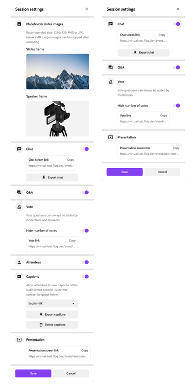
- A new type of presentation screen that only shows the chat messages was introduced for virtual and non-virtual sessions. Just like the presentation screen that shows the Vote & Ask questions or the slides and speaker, the link to the screen can be found in the session settings and moderated from there.
- The virtual (left) and non-virtual (right) session settings have been reorganised and are now sorted by feature.
- Links to the meta-fusion's on-demand video player can now be added as external on-demand room. The link format is as follows:
https://linkToVideoOnDemand/?metaFusionClientId=clientId&metaFusionEnabled=true&metaFusionProjectId=congress2024&onDemandMetaFusionId=sessionId
In the web app, the player will be embedded in an iframe so that users do not have to leave the web app to see the video.
Bug fixes
- List pages with a banner are now optimized for small screens. Before, the left and right margin was too big, resulting in very little space for the content.